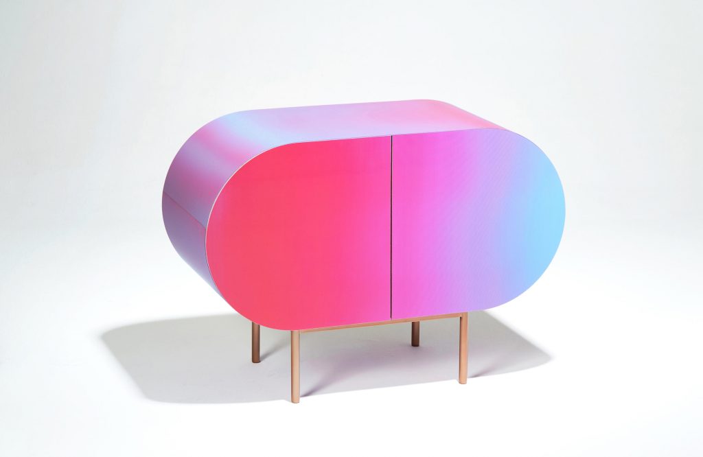
Designing in colour means filling the spaces. If what Yves Klein said is true, and colours are the real inhabitants of space, designers and artists are the artificers of the relationships between humans, objects and the environment. Against rampant conformity are ranged custom products; these unique pieces between art and design signal the way. But, colour also contributes to making the environments in which we live more personal, expressions of the unique beings that inhabit them. For the coming year, the Pantone Color Institute highlights the desire for colours that transcend the seasons, satisfying the need of fashion and industrial designers to express their originality and creativity through self-expressive colours.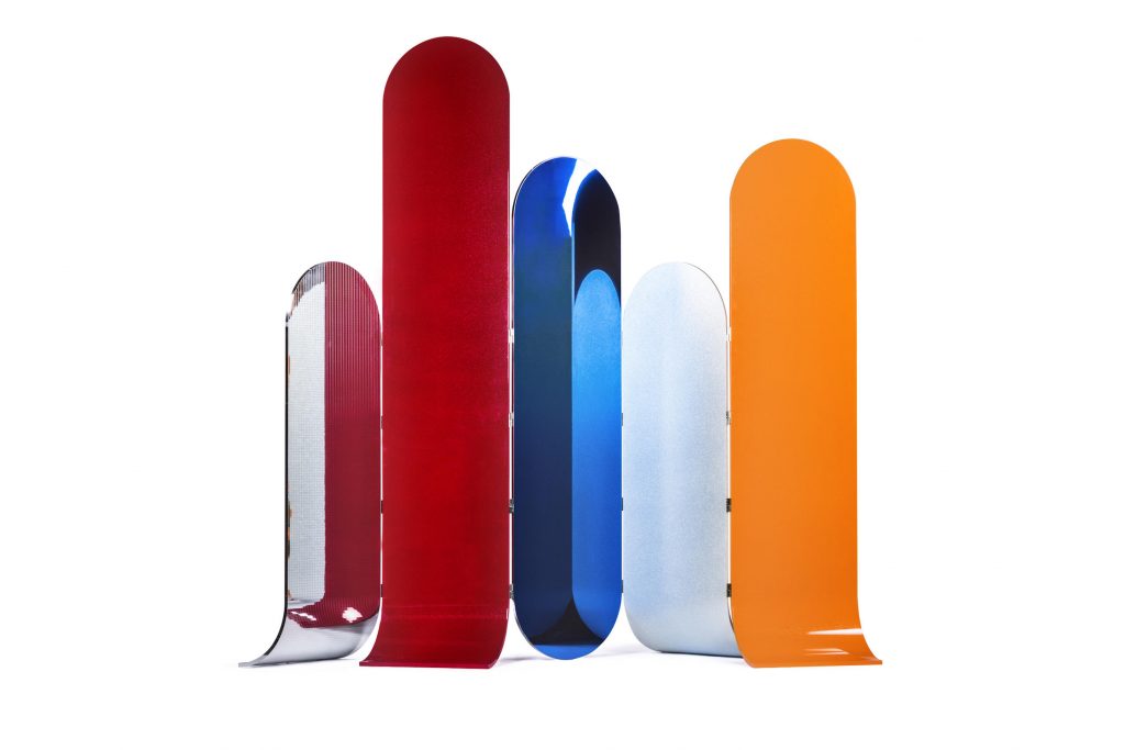 Surprising hues like Valiant Poppy, Russet Orange, Ultra Violet, Limelight, Quetzal Green and Pink Peacock, encourage unexpected and unconventional choices by experimenting with combinations and materials that reinvent the history of colours – as well as the relationship between ourselves and the world around us. For example, with Color Flow and Color Words, the Korean studio Orijeen uses colour to remind us of the relationship that we have with objects and cultural references.
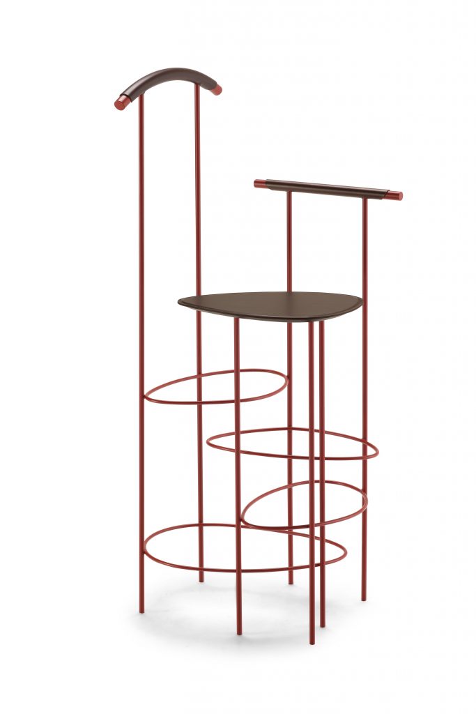
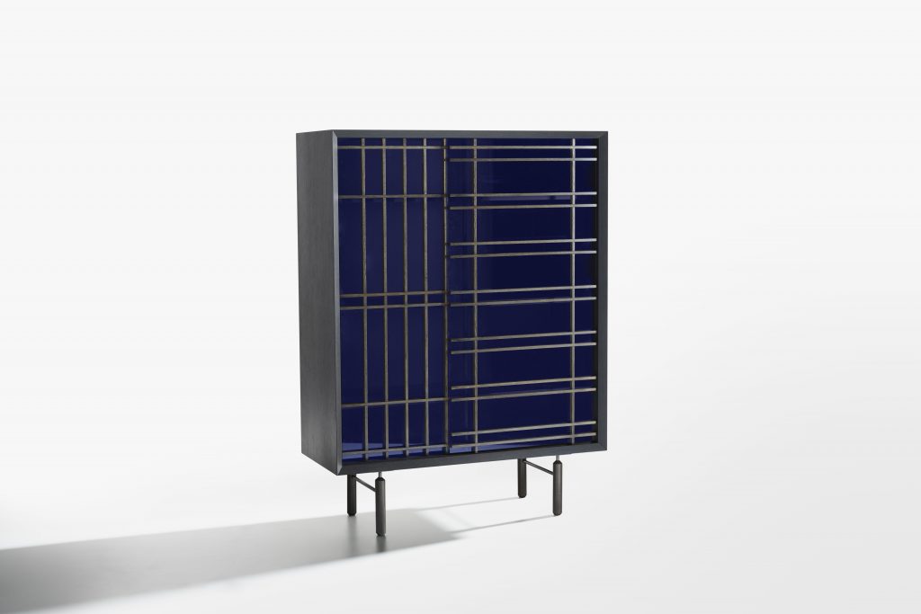
Analogia Project, two young designers – Roman by birth but Milanese by choice – selected Bordeaux for the Viae valet stand for Frag, while Chiara Andreatti combines wood with intensely blue glass in Sen for Potocco.
Photos:
Galactica, design Antonio Aricò
Color Flow, Orijeen
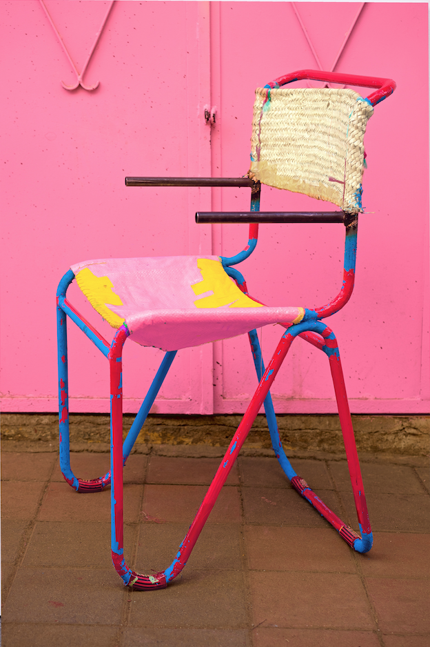
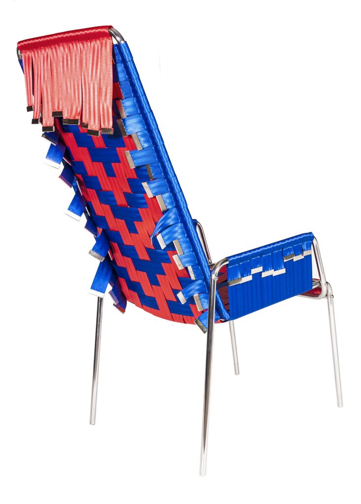
Cinto Chair, design Carol Gay
Diagonal, design Sander Wassink
Viae (Frag), design Analogia Project
Sen (Potocco), design Chiara Andreatti
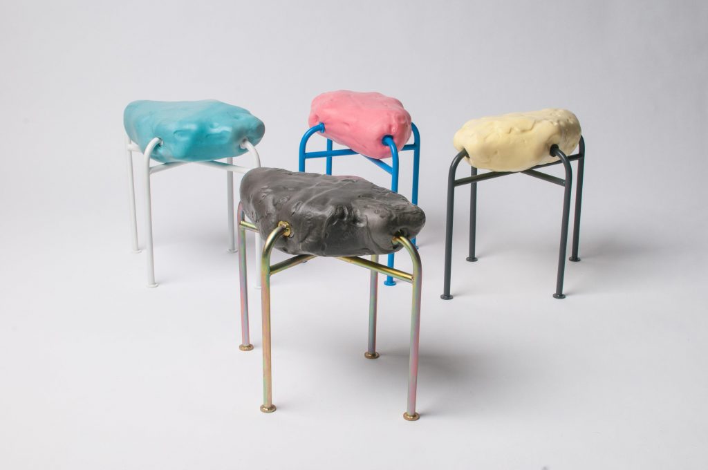
Moonscape stool, design Lukas Lüttgen

