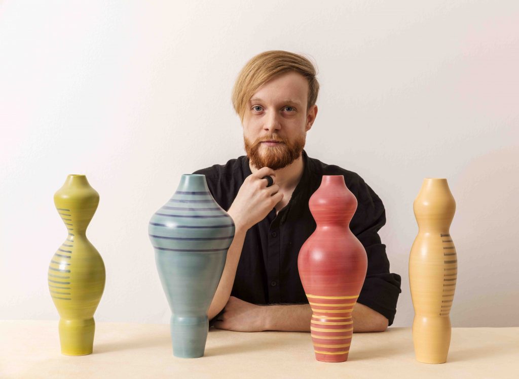
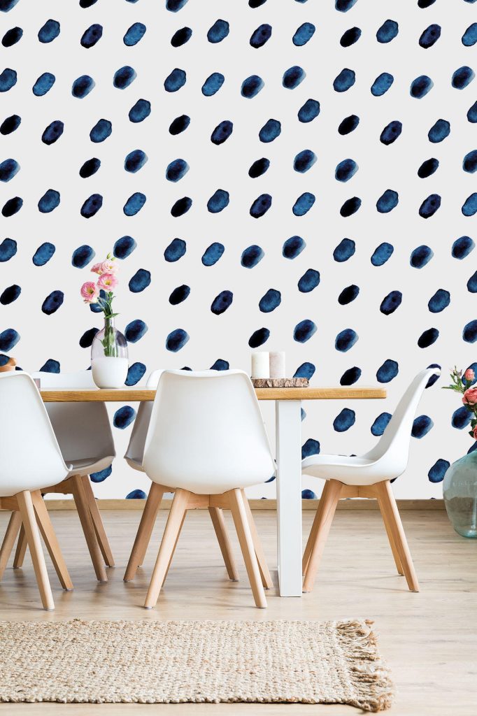
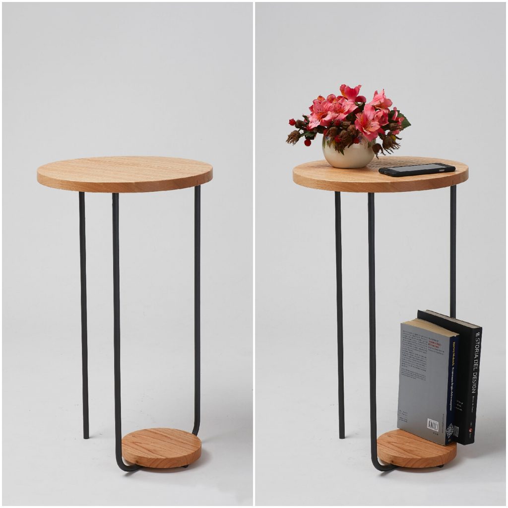
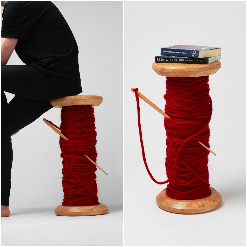
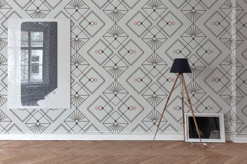
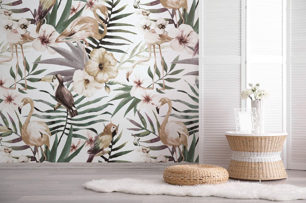
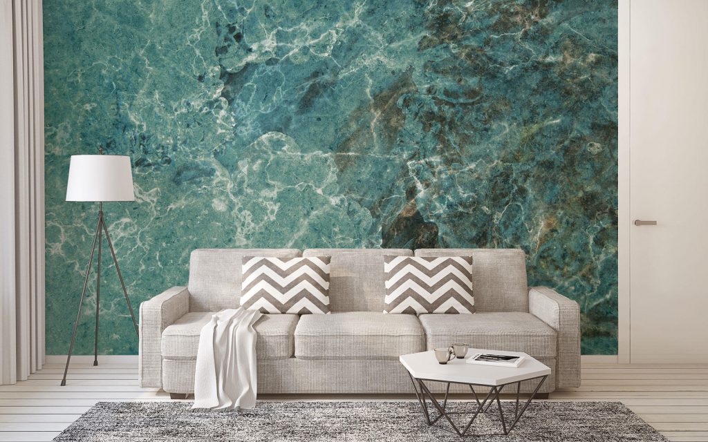
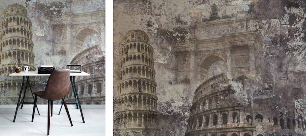
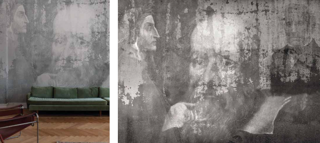
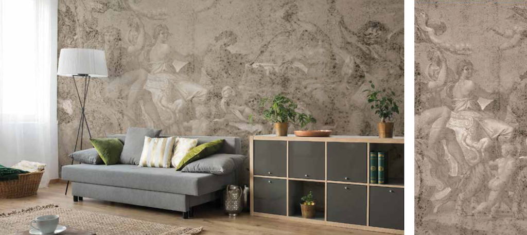
Thanks to a futuristic and emotional approach and at the same time with a clear reference point to Bruno Munari’s approach in the project analysis, the product & graphic designer Matteo Stucchi (born in 1992) creates geometric and organic shapes, cheerful and colourful.The Wind Rose vases collection, a tribute to the feminine universe. After graduating in Industrial Design, he started to produce his first collection of ceramic vases, The Wind Rose. His design is the perfect balance between precision and imagination. The key words of his projects are beauty and comfort. His mission is to create unique products that will revolutionize industrial design.Matteo Stucchi and Tornilegno share the same passion for the Italian handicraft, woodworking and the love for design. It is from these passions that they decided to collaborate together and to create the small table Nesso and the chestnut wood stool, named Spoletta, the perfect home furniture that enhances Italian handicraft.Nesso is the result of the union of two raw materials of the past: wood and iron. Its shape is simple and minimalistic: it is made by two circular elements with different measures. Nesso is thought as a small table around which people will meet up or enjoy their time. The way it is created is elegant and refined. Its unique details are the results of Tornilegno’s great experience in woodworking.The inspiration comes from the seamstress’s world: Spoletta is a spool indeed. The creativity lies in creating a giant and funny spool that can have two functions: it could be either a table or a stool. Spoletta wants to create harmony and a balance in the places in which it will be placed. During the Milano Design Week 2018 Matteo Stucchi designed for Limonta | 1893 seven different wallpapers for the Limonta Italian Wall Couture collection.INCONTRI. Minimal but of great visual impact. Essential shapes and lines replicating themselves in neat, hypnotic patterns playing with light, simulating volumes and evoking matter. Perfect balance of complementary colours or shades, in contrast, simplicity becoming life essence. The pure, linear design is a map of geometries exalting space and interiors, emphasized by staging graphic elements in series. ARMONIA. Intense, dynamic, organized in strong colours and iconic images. Inspired by the real world whose essence is unveiled by the graphic line, these creations paint the walls of far away horizons. Re-elaborated to find its true soul and structure, rendered through the psychedelic effect of the leaves changing in brushstroke, shade or colour, nature is here portrayed in its most intimate, minimal graphics aspect, or celebrating its opulence through elements that remind tropical landscapes and exotic places. VITA. Strongly inspired by reality, intentionally with a raw material effect. Texture, geometries and decors tell us about the roughness and lines of wood, the toughness and stratifications of rocks, the unlimited drawings of marble, with arrogant colours or soft nuances. Lines and marquetries are stolen from nature play the leading role in this series where graphics and photography mix to create a strong visual impact. SAPIENZA (n.1), (n.2) and (n.3). Evocative, refined, almost mysterious. Geometrical shapes repeated endlessly, faces, profiles and silhouettes barely outlined, universe becoming sketch, humble azulejos making the rules, emerging from a light monochromatic background with the strength of the graphic line. Art, poetry, architecture, painting and music live through their own symbols, destructured and reinvented, on canvas to be interpreted.